Brand Development @Formlabs
Formlabs, a leader in 3D printing technology, has transformed industries by making professional-grade 3D printing accessible and efficient for engineers, designers, healthcare professionals, and manufacturers. Founded on the principle of democratizing digital fabrication, the company has grown to offer a suite of products that combine powerful hardware, innovative software, and high-performance materials.
Over the past eight years, I’ve been part of Formlabs’ journey — starting as a graphic designer to becoming art director and, most recently, serving as Creative Director for the past four years. In this leadership role, I’ve driven the creative vision and strategy for the company’s global brand presence. My primary mission was to elevate Formlabs’ identity, ensuring that our brand storytelling resonates with both technical and creative audiences across industries.
Evolving in a Rapidly Changing Market
When I moved into the Creative Director position, the company was at the center of a competitive and evolving 3D printing landscape. As the industry expanded beyond early adopters to mainstream businesses, we needed to transition from being perceived as an overpriced prosumer brand to a trusted leader across diverse sectors like healthcare, education, and manufacturing. This required a significant shift in how we communicated our value proposition and differentiated our brand.
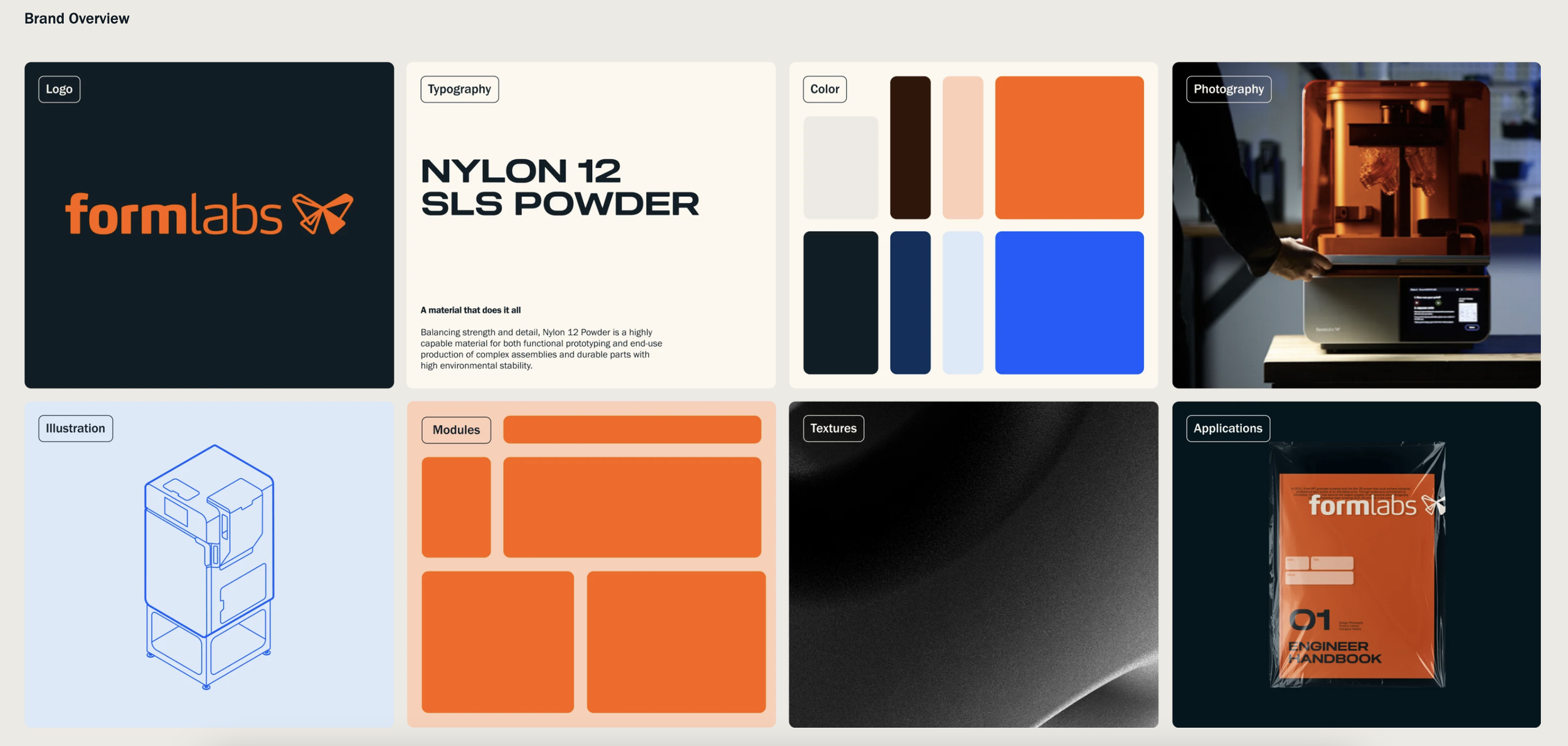
A key objective was to unify our brand visuals to create a consistent and recognizable identity that resonated with diverse audiences, from engineers and manufacturers to healthcare professionals and educators. This propelled a brand refresh complete with super comprehensive brand guidelines, ensuring consistent visual and verbal communication across all touchpoints, and aligning the creative team, and company as a whole, around a cohesive vision.
Beginning in late 2023, I led a collaboration with an external branding agency, Moving Brands, to develop a cohesive and recognizable brand presence that functioned properly across all global channels. Together, we standardized our visual and verbal communication, refining everything from color palettes, typography, imagery standards and introducing new graphic elements to the brand styles. After the brand development was fully realized, the execution of the rebrand was brought to the in-house team to roll out across mediums.
REBRAND OBJECTIVE: further distance from hobbyist aesthetic
Transition brand perception from overpriced prosumer brand to a trusted leader in additive manufacturing industry across diverse sectors, including healthcare, education, and manufacturing.
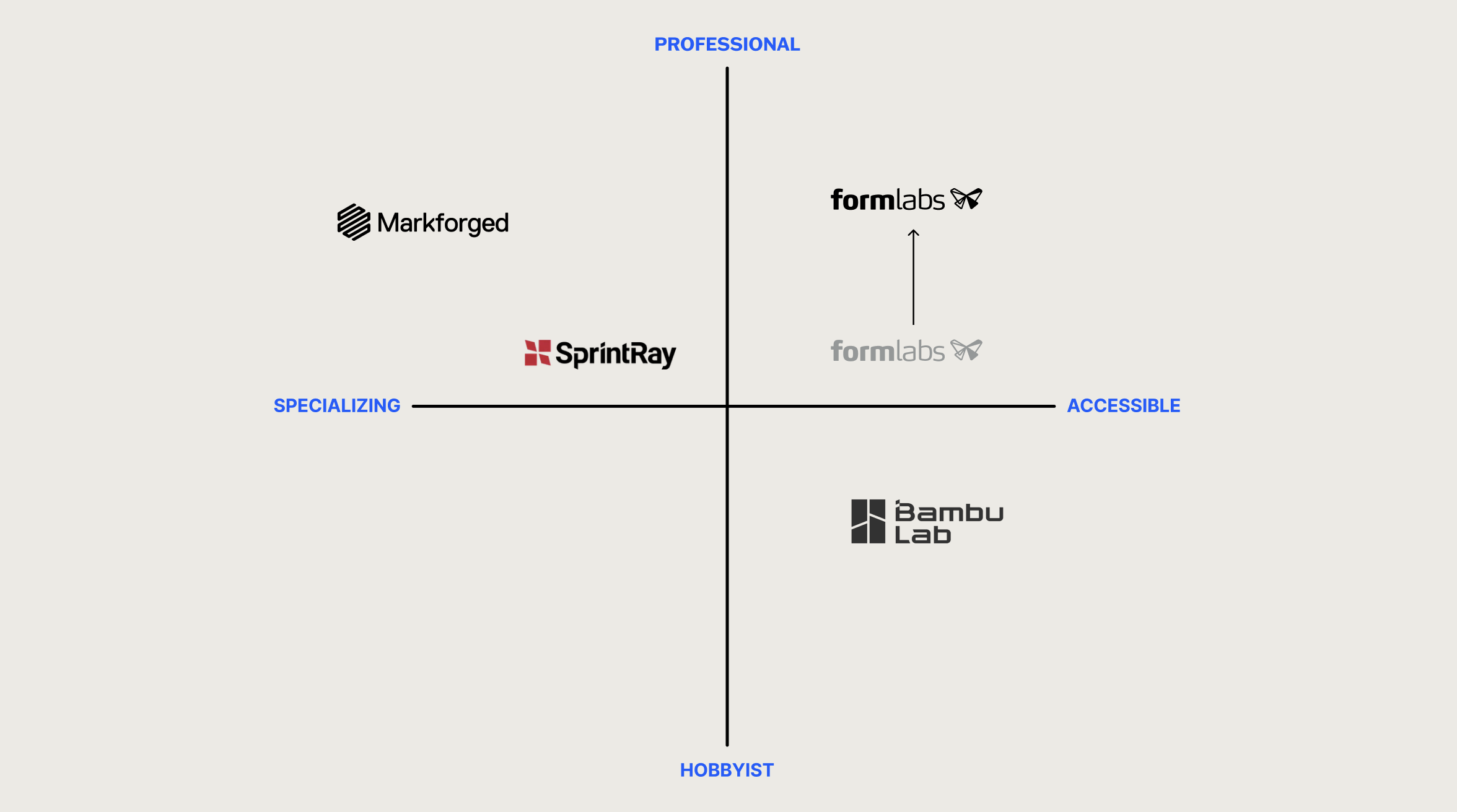
REBRAND OBJECTIVE:
unify brand visuals to create a RECOGNIZABLE identity
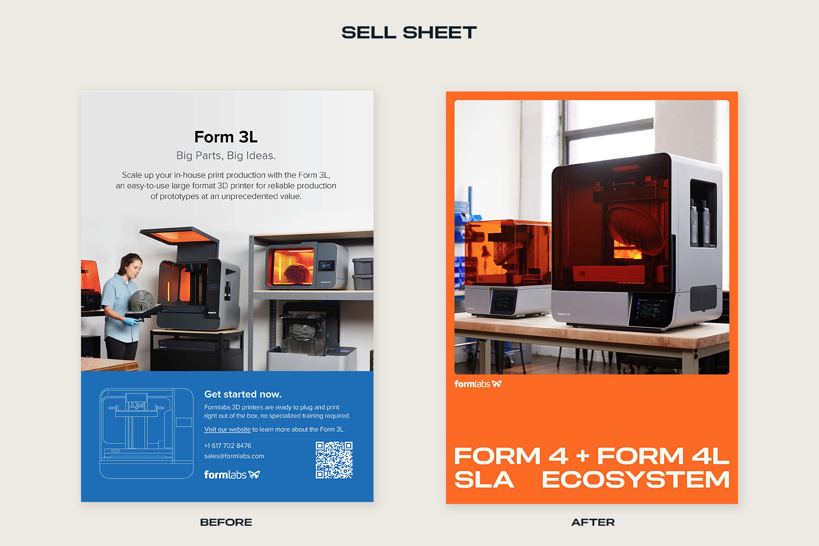
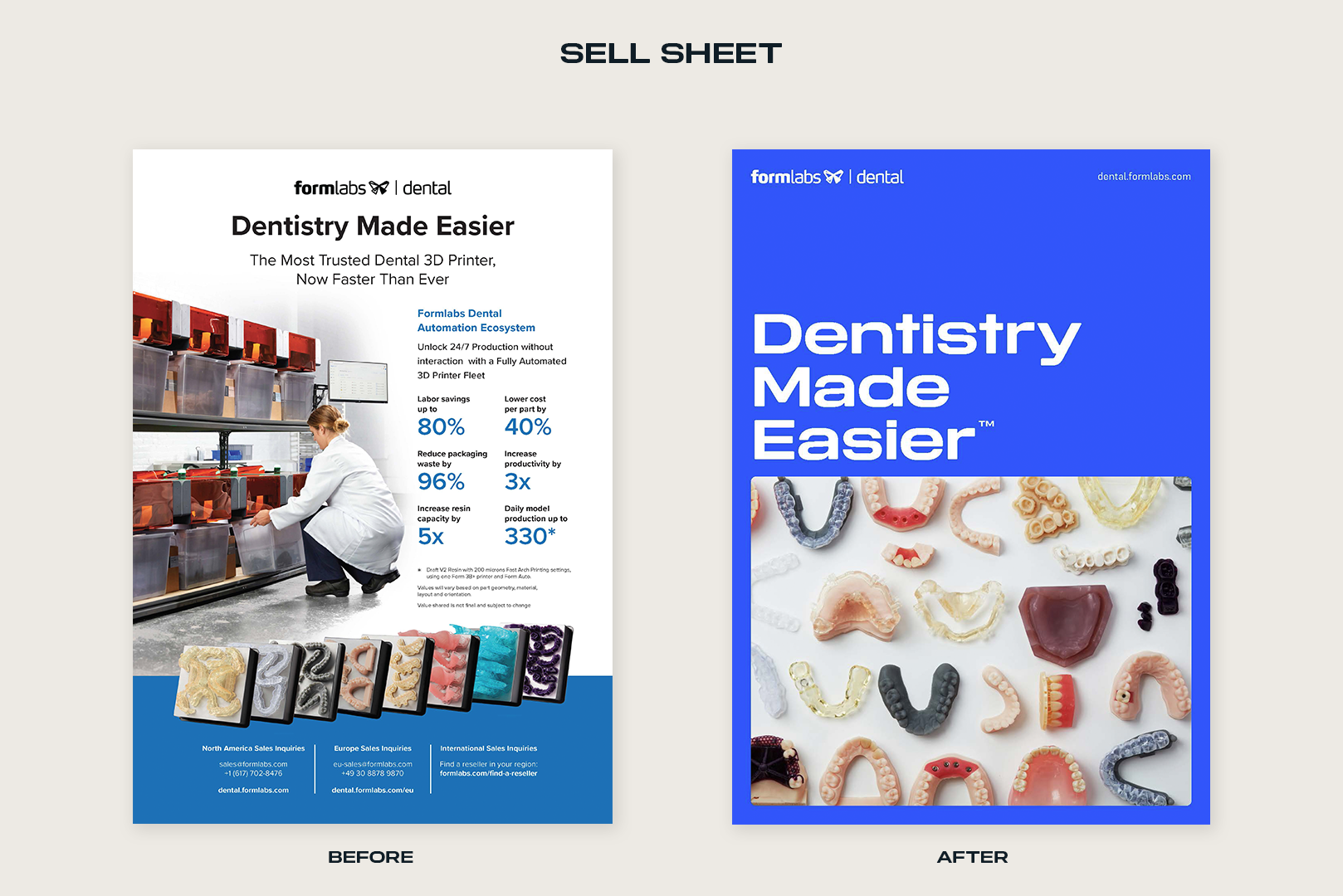
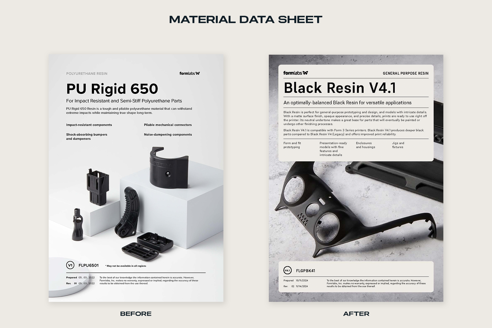
BEFORE:
Below are some examples of where the Formlabs brand was before the brand update project. Years of rapid growth left the brand with styles that were unexpressive and with no foundation for consistency across mediums. We were over indexing on the original blue brand color as our only ownable brand style.

AFTER:
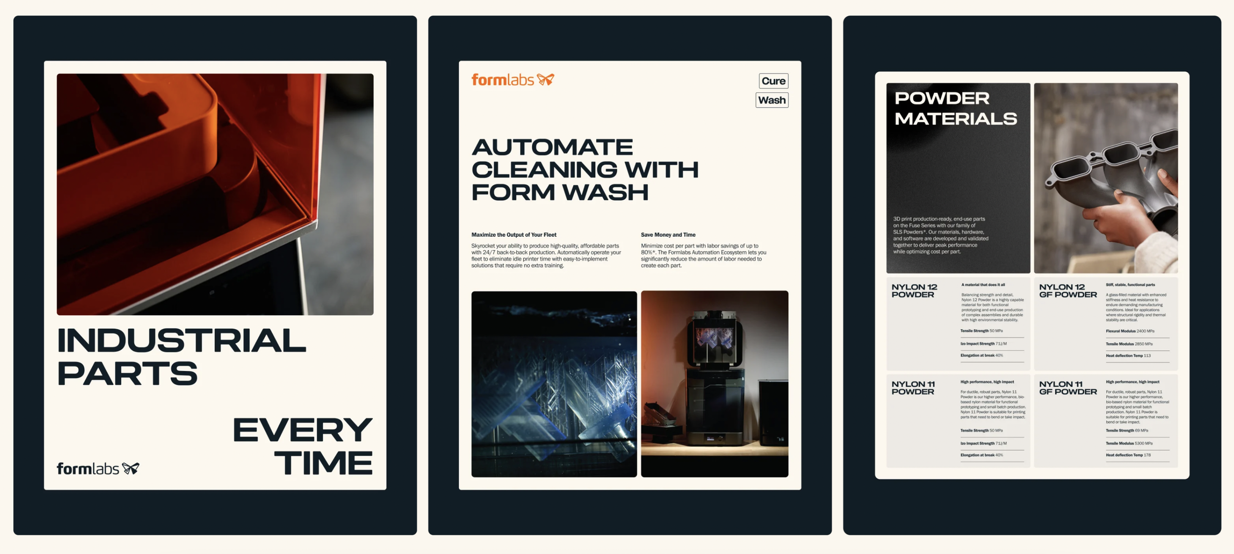
After taking the time to reassess if the blue color was serving the original purpose of conveying the message of a reliable brand – the decision was made to update the primary brand color to be the same orange as the hardware. This color also allowed the brand tone to shift from passive ‘reliability’ to bolder, masculine “industrial” statement, especially when aligned with intentional photo styles.
Additionally, it was important to create a system of ownable graphic styles that, as a whole, function to create a memorable brand that stands out within the manufacturing-tech industry. Choosing to adopt a display font with a retro feel worked as an intentional statement that nods to both expressive industrial design and the glory days of US manufacturing.